Coach first
Movement quality and smart scaling come before speed or load.
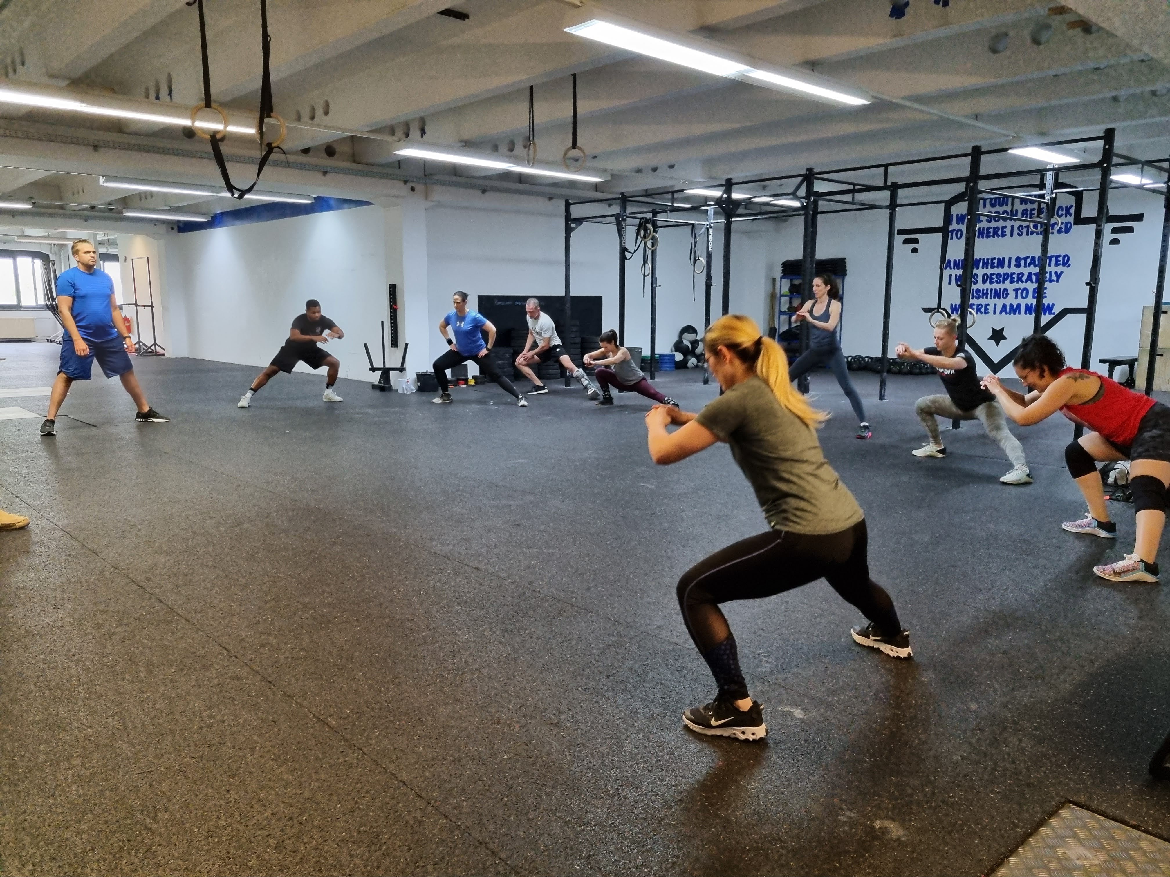
CrossFit Liberty is designed around coached movement, consistent effort, and practical strength for everyday life.
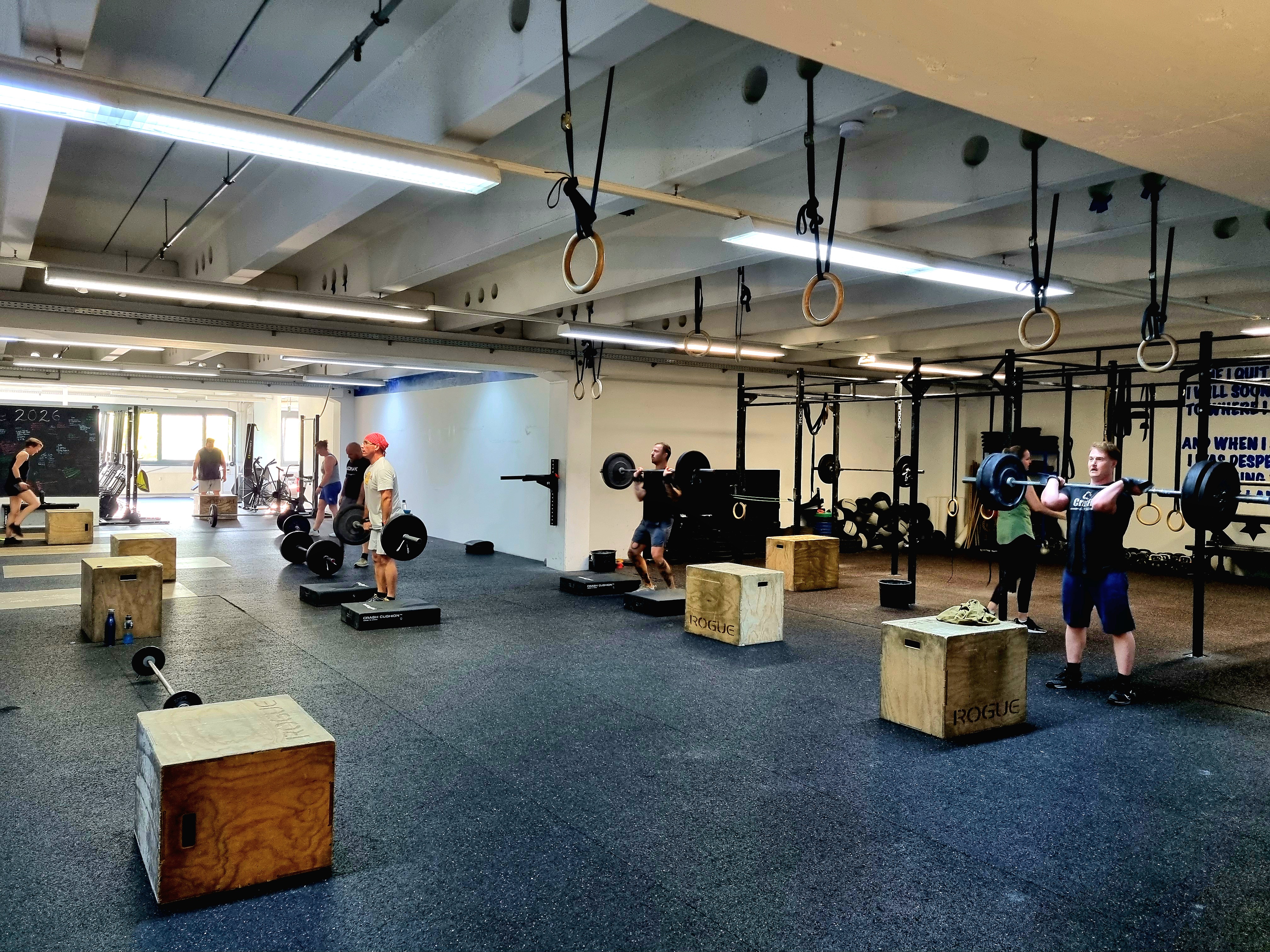
Our approach
Classes combine strength work, conditioning, skill practice, and coaching feedback so athletes understand both what they are doing and why it matters.
Every workout can be adjusted. The goal is not to impress the room; the goal is to build capacity that lasts.
Principles
Movement quality and smart scaling come before speed or load.
Progress comes from sustainable training that members can return to week after week.
New athletes deserve clear language, patient instruction, and a practical path into class.
The best training environments create accountability without ego.
First visit